Context
26 September 2021 By PDSNETThe context within which a chart is viewed is vital to your understanding of it. In this article we will attempt to show the broader context within which we view the market action which took place last Friday.
INTRADAY
Let us focus our attention on the S&P500 index, which is a weighted average of the 500 largest companies trading on Wall Street. The following chart shows an intra-day picture of what happened to the S&P500 on Friday 24th September 2021:
.png)
The first thing to notice is that the index closed at 4455.48 – up 0,15% on its previous close of 4448.98. Studying the day’s movement, you can see that in an intra-day chart like this, the previous day’s close is very important to how the chart unfolds through the day.
The S&P began the day significantly down on the previous close but quickly moved up to test that level before falling back and then rallying once more to break above the previous close. It could not sustain that break and fell back once again to find strong support at about 4440 (the blue arrows). It went up again to test the previous close and once again fell back to the support at 4440. Altogether it made three bottoms at 4440 (the three arrows) before rising once more and this time managing to penetrate the previous close. From 12pm until about 2.30pm it hovered just above and below the previous close before finally moving up to its intra-day high above 4460. The final close saw the index just fractionally up at 4455.48.
It is both educational and interesting to watch the progress of the S&P500 through its daily trades. The market opens at around 3.30pm South African time and closes at 9.30pm. You can view it real-time at:
Google
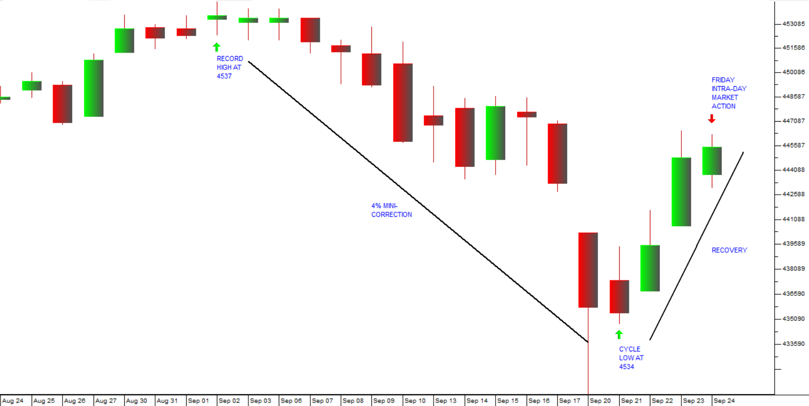
THE MINI-CORRECTION
Looking more widely, you can see that Friday’s market action (the green candle on the extreme right of the chart below) was part of the recovery from what looks to be a “mini-correction” which took the S&P down 4% from its record high of 4537 made on 2nd September 2021.
Now let us consider that “mini-correction” in the context of what has happened since the start of the pandemic last year.
RECOVERY FROM COVID-19
We regard the V-bottom caused by COVID-19 to be a “black swan” event which was caused by factors which were completely outside the economy and the markets. It impacted markets because business lockdowns temporarily halted all work and because central banks added enormously to the monetary stimulation and fiscal stimulation that was already out there.
As it become clear that the pandemic was coming under control, investors correctly assessed that the additional stimulation would result in a massive rise in the corporate profits and they pushed the S&P to a series of new record highs:

You can see from the chart above, the “mini-correction” shown in the previous chart is at least the 8th such correction since the “V-Bottom” caused by COVID-19.
THE GREAT BULL TREND
Widening the view still further in the next chart, you can see that the COVID-19 “V-bottom” and the subsequent record-breaking upward trend are part of the greatest bull market on record. The following chart shows the 12 years of that bull trend which began after the sub-prime crisis when the S&P reached an intraday low point of 666.79 on Friday 6th March 2009.
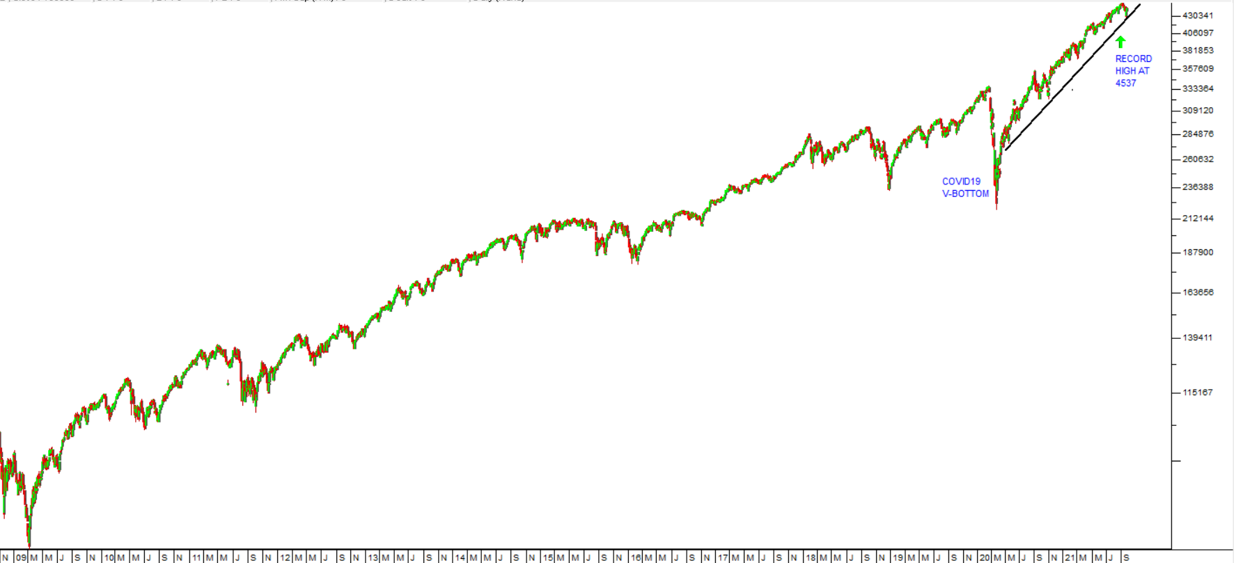
In our view, this massive bull trend must be seen as the direct result of the unprecedented and continuing monetary and fiscal stimulation which has been applied to first world economies since 2008.
KEYNES AND GREENSPAN
And then, of course, that monetary and fiscal stimulation must also be seen in the context of the socio-political history of America which has its roots in the Federal Reserve Bank’s response to the 1929 crash. To get an idea of our views on this, you should read a document which we call Our Background Approach on our website. This document was last updated on 28th August 2020 – just over a year ago. Since then, markets have continued to rise inexorably - as we anticipated.
Our advice to private investors has been to “make hay while the sun shines” but be very aware that eventually the music will stop.
DISCLAIMER
All information and data contained within the PDSnet Articles is for informational purposes only. PDSnet makes no representations as to the accuracy, completeness, suitability, or validity, of any information, and shall not be liable for any errors, omissions, or any losses, injuries, or damages arising from its display or use. Information in the PDSnet Articles are based on the author’s opinion and experience and should not be considered professional financial investment advice. The ideas and strategies should never be used without first assessing your own personal and financial situation, or without consulting a financial professional. Thoughts and opinions will also change from time to time as more information is accumulated. PDSnet reserves the right to delete any comment or opinion for any reason.
Share this article:
.png)
.png)
.png)