In technical analysis, a data stream is any continuously up-dated stream of financial or securities pricing data, like a share’s daily closing price, an index, commodity price, currency exchange rate or derivative contract price. As an investor, your challenge is to predict the future path of data streams well enough to be able to make a profit. In your efforts to do this, one of the simplest and yet most powerful tools available to you is the comparative relative strength chart (this should not be confused with the relative strength index or “RSI” which is an indicator in its own right and has no relation to the comparative relative strength or relative strength as it is known).
Work through this simple example…
The mining company Sibanye closed at 7292 on 16th April 2021 (Friday). On that same day, the JSE mining index (JS5513) closed at 65518. If you divide the price of Sibanye on that day by the mining index you would get 0,1112976. The next trading day, 19th April 2021 (Monday), the mining index closed at 64250 – down 1268 points while Sibanye closed at 7044c – down by 248c, so dividing Sibanye by the mining index gave us 0,109634. This shows quite clearly that on that day (19th April 2021) Sibanye under-performed the mining index. Both went down, but Sibanye went down by more than the mining index in percentage terms. Or to put it another way, Sibanye went down by 3,4% while the index only went down by 1.94% - which means that the mining index out-performed Sibanye on that day.
To calculate a relative strength all you need to do is to divide one data stream by another and then draw a graph of the result. Obviously, if you divide the mining index by Sibanye you will get an exactly inverted chart – so you must always be careful what you are dividing by what.
The obvious use for a relative strength is to establish whether a particular share has performed better than its sector index over a certain period. To see that all you need to do is to divide the index by the share’s price at the end of each trading day and draw a graph of the result. If that chart goes up, then the index is doing better than the share and vice versa.
Consider the following chart:
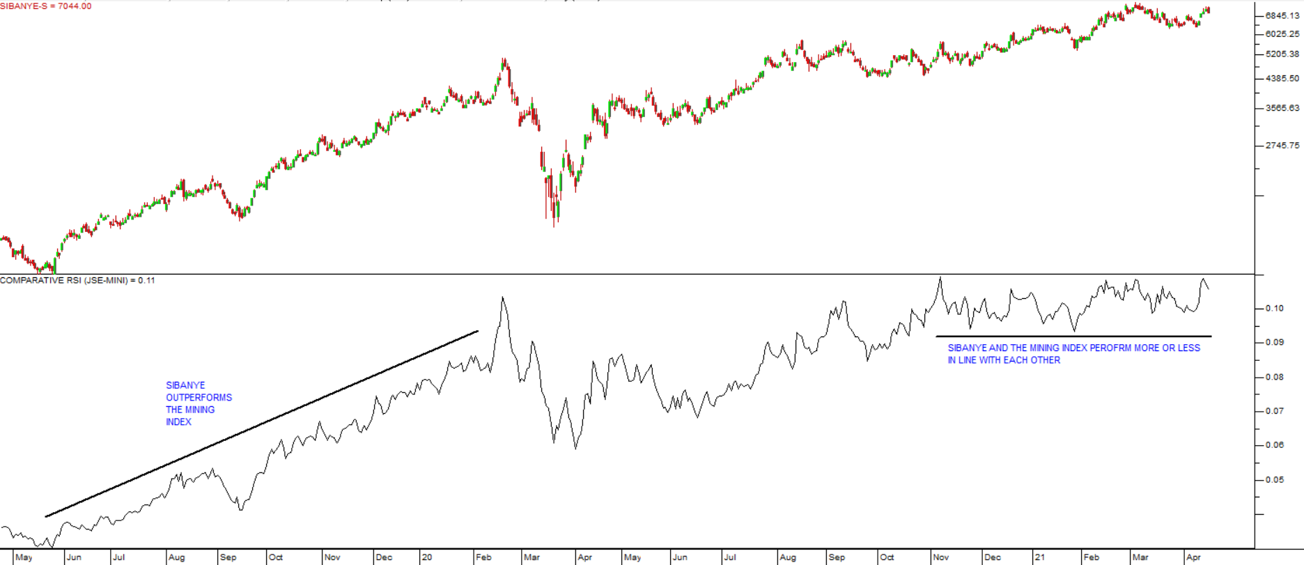
The top half of the chart is a candlestick chart of Sibanye over the two years from May 2019 to April 2021.
The bottom half of the chart is a relative strength which shows that over that period, Sibanye was mostly outperforming the JSE Mining index between May 2019 and February 2020. And then you can see that from November 2019 to April 2021 the chart flattens out showing that the two data streams performed very much in line with each other.
This shows how this simple comparison can reveal very interesting relationships between various data streams. You can answer questions about the relative performance of a share against the average of its sector or the JSE as a whole or against another share – or any other data stream in your database where you think there may be a useful or interesting relationship.
To add the relative strength to your chart, open the share you wish to compare, click on the drop down menu for “All Indicators” in the bottom left of your screen and then click on “Comparative RSI”. Choose your parameters and click on “ok”.
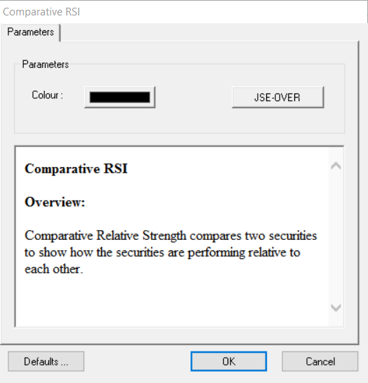
Just remember that the chart which is on your screen at the time when you invoke the relative strength will be on the top of the fraction and the data stream which you are comparing it with will be on the bottom of the fraction. Thus, in the example above of the JSE Mining index and Sibanye, The JSE Mining index was on the top and it was divided by the price of Sibanye. Obviously, if we began with a chart of Sibanye on the screen and then divided it by the JSE Mining Index the resultant chart would be exactly inverted.
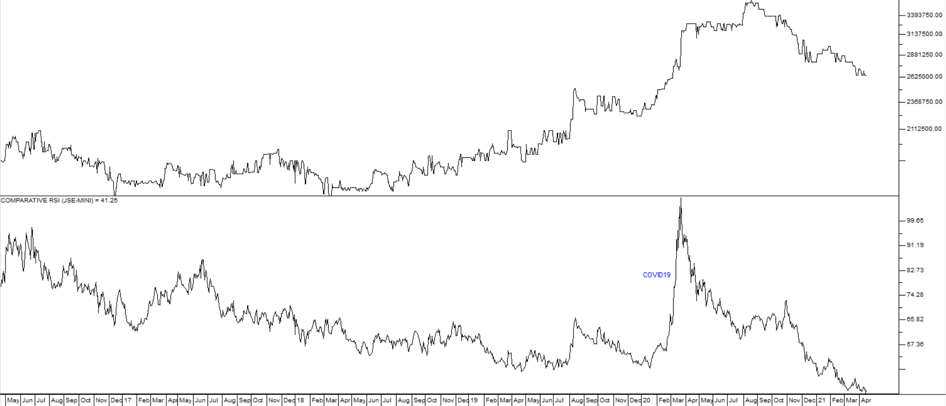
Relative strength can reveal unexpected relationships between a wide variety of data streams. For example, it would be reasonable to expect that the krugerrand would perform very much in line with the JSE mining index - but the following chart of the krugerrand divided by the JSE mining index shows that, in fact, the mining index (which is an average of the mining shares trading on the JSE) has been out-performing the krugerrand for most of the past five years with the brief exception of the start of the COVID-19 pandemic in February/March 2020 and that now that out-performance is continuing:
This type of understanding could have a major impact on your investment decisions.
NET ADVANCE DECLINE LINES
The database of your charting software contains a number of Net Advance/Decline (Net A/D) lines. Net A/D lines are drawn by subtracting the number of shares that go up in a particular section of the market from the number that go down and then adding or subtracting that difference to a running total – and, finally, then drawing a chart of that running total.
A/D Line = (Stocks that are going up – stocks that are going down) + previous period’s A/D
So on the days when more shares go up than down, the Net A/D chart will rise and vice versa. To look at a Net A/D chart on your software, just type “Net” on your keyboard (as you do when you open a share) and then select which Net A/D you want to look at.
Net A/D charts make no distinction between companies with high market capitalisations and those whose market caps are low. So individual small and large companies have exactly the same impact – it’s just the number of companies whose shares went up minus the number that went down. This is not true for the JSE indices where they are carefully weighted to reflect the relative size (market capitalisations) of the companies concerned.
For this reason, when small cap shares are doing relatively well, the Net A/D will rise more quickly than when large cap shares are doing well. So it is interesting to compare an index (which is weighted) with its Net A/D (which is not). Consider the following relative strength chart of the JSE industrial index against its Net A/D over the past 10 years:
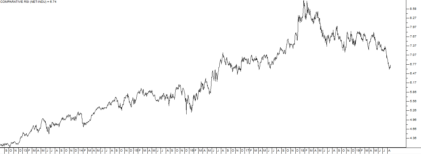
Here you can see that for most of this period, large cap shares out-performed small cap shares – unit January 2018. This was probably because most large cap shares have substantial overseas interests which hedged them against the damage done to the South African economy during the Zuma era.
With the advent of the Ramaphosa administration, small cap shares began to outperform large cap shares and that trend was exaggerated by the impact of COVID-19 in March 2020. Finally, as markets began to recover from COVID-19, the large cap shares benefited most from their overseas interests and began, once again, to outperform the small caps.
To display this type of chart in your software, first put this JSE Industrial index (J520) on your screen. Then click on “All Indicators” in the bottom left of your software and then click on “Comparative RSI”. In the parameters box, choose the Net A/D for the industrial sector and then click on “ok”.
CURRENCIES AND GOLD
One of the most difficult aspects of investing in the share market is that valuations are constantly being eroded by inflation. The purchasing power of R100 today is nothing like it was 10 years ago – or even 1 year ago. Shares, being “real” assets, tend to constantly adjust upwards for inflation – after all, the companies which they represent have to constantly increase the prices of their products to keep pace with inflation. The relative strength chart offers you some unique ways to adjust your chart for the effects of inflation or weakness in the rand or other currencies. For example, you could look at the Dow Jones Industrial index of the 30 largest companies trading on Wall Street - priced in gold. Gold is the ultimate store of value in the world and pretty much unaffected by inflation. Consider the chart:
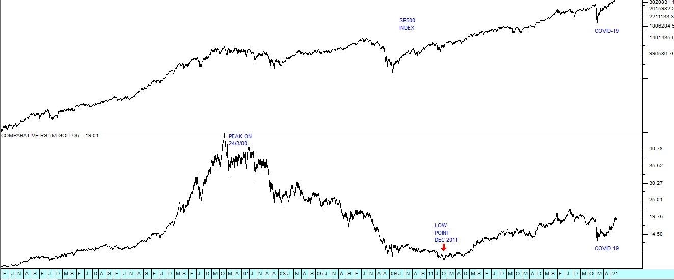
The top half of the chart shows a semi-log chart of the S&P500 index going back to July 1988 – just after the market recovered from the 1987 crash. The lower half shows that same S&P500 index – but this time divided by the US dollar price of gold using a relative strength. As you can see, the top chart shows the index rising steadily over the years, interrupted by a few bear trends.
The lower chart shows a completely different picture. Priced in gold, the 500 largest companies in America rose sharply, reaching a peak in March 2000. For the next 11 years the S&P500 fell more rapidly than gold causing a downward relative strength - until December 2011. Since then, for the past 8 or so years the Dow Jones has been rising in terms of gold. You can repeat this experiment by dividing the S&P500 by the euro/US dollar exchange rate which will show you the DJ valued in euros – or you could value the JSE overall index in US dollars, Japanese yen or Chinese yuan. The possibilities are endless.
Read the article on our website dated 10 May 2017 for an example of the Comparative RSI in use - Wall Street Steams Ahead.
By 8th January 2021, the S&P500 index had climbed to 3824 showing that the predictions made in that article were correct.
So, the humble relative strength chart can eliminate the impact of inflation and the movement in currencies to show you the real underlying trends. It can also show you which shares are doing the best in a particular sector or in the market as a whole.
We suggest that you experiment using the relative strength to establish relationships between the wide variety of data streams in your database.
GLOSSARY TERMS:
Warning: mysqli_num_rows() expects parameter 1 to be mysqli_result, bool given in C:\inetpub\wwwroot\newage\onlinecourse\content\lecture_modules_content.php on line 21
List Of Lecture Modules
