Following on from our discussion in Module 24 about the different types of moving average which you can apply to a share (weighted, exponential, time series and triangular), this module discusses the calculation, application and interpretation of Bollinger Bands.
Bollinger Bands are a type of “envelope” which is designed, mathematically, to contain as many as 95% of daily share prices within a “normal” trading range. Obviously, that then leaves those prices which are outside that range as abnormal and hence a potential buying or selling opportunity.
Bollinger bands were developed by John Bollinger (a chartered financial analyst or CFA) and explained in his book “Bollinger of Bollinger Bands” in 2001. He also then went on to author the “Capital Growth” newsletter. He developed the idea of “rational analysis” which he defined as the overlap between technical analysis and fundamental analysis.
Every share listed on the JSE has different fundamental and technical characteristics which are constantly changing. These characteristics are reflected in the share price volatility and sensitivity. For this reason, the Bollinger Band method calculates two points which are 2 standard deviations above and two standard deviations below a moving average of the share price.
Standard deviations are a part of statistical analysis – more specifically they refer to the so-called “bell curve”. For you to understand them we need to spend a little time talking about statistics, and how the bell curve works.
The idea is that any group of statistics will conform to a pattern known as a bell curve. For example, if you take the heights of all the people in a football stadium, you will find that most of them are close to the average height – but there will be some very short people and some very tall people. That fact can be represented as a bell-shaped curve, like this:
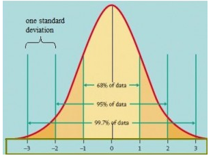
Most of the people from the football stadium will be close to the average (in the center) and as you move away from that average on either side you have less and less people. A standard deviation is a measure of a certain distance away from the average on either side. One standard deviation on either side of the average is drawn so that 68% of people’s heights fall within that band. Two standard deviations includes 95,4% of people – which means that only 4,6% of the people, those who are either unusually tall or very short, will fall outside two standard deviations.
So how does this apply to the share market?
Your software will make a moving average of the prices of the period which you choose and then calculate the Bollinger Bands based on the moving average for that period. So if you choose a period of 50 days, then the computer will calculate the 50-day moving average and the point which is two standard deviations above that point and two standard deviations below. This approach is followed each day resulting in an upper band above the moving average and lower band below it. 95,4% of the chart’s prices will fall between the upper and lower bands leaving just 4,6% outside the band – 2,3% above the upper band and 2,3% below the lower band. The idea is that statistically those points above the upper band must be overbought and those below the lower band must be oversold.
Open your software and choose a share. Then go to “All Indicators” in the bottom left corner of your software, use the drop down arrow to find and click on “Bollinger Bands” and then click on your chart. You will immediately see a new window which looks like this:
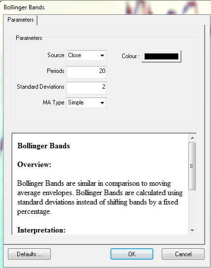
You will see that this screen provides a field into which you can choose the “source” data stream that you want to use to calculate the Bollinger Band. That can be the share’s close, high, low or opening price but usually Bollinger Bands are based on the share’s closing price. Next you can select the number of days’ data (or periods) that you want. This refers to the number of days to be included in a moving average of the data points for the calculation of the Bollinger Bands. Next, you can choose the number of standard deviations that you want to use – bearing in mind that 2 standard deviations are normal for Bollinger bands. Finally, you can choose exactly what type of moving average you want the computer to use in the calculation of the Bollinger Bands (weighted, exponential, time series or triangular).
Once you have made these choices, and clicked “ok” the computer will do the calculations and draw the Bollinger Bands onto your graph. Consider the following chart:
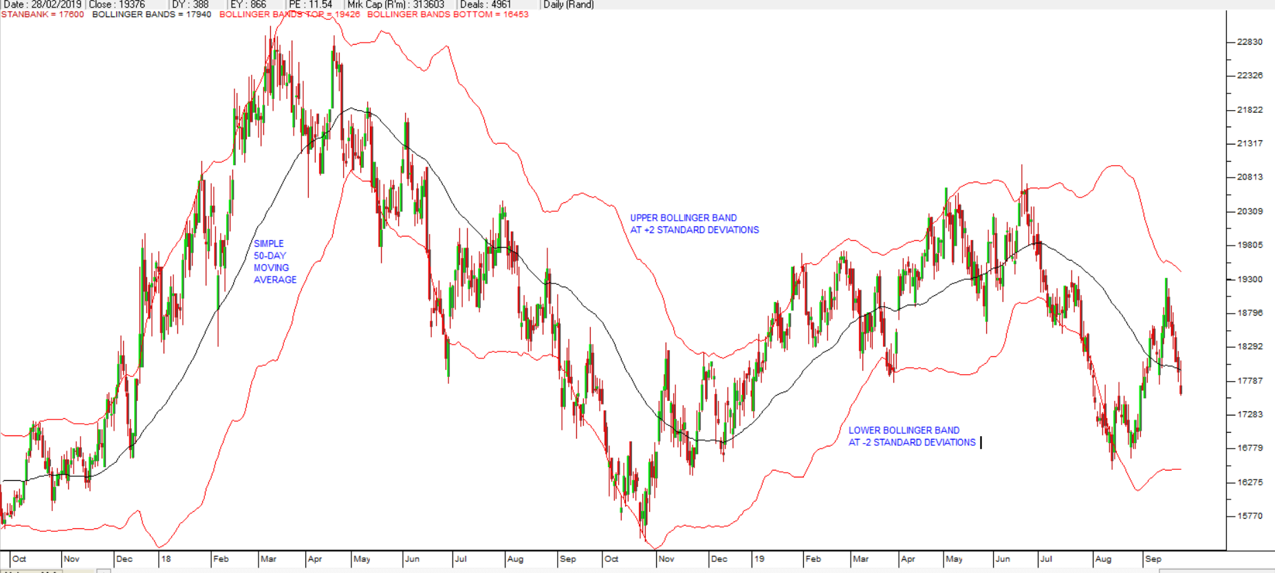
Your chosen moving average is the black line drawn through the middle of the price data (50-day) and then the upper and lower Bollinger Bands are 2 standard deviations above and below that. Notice that when the price moves quickly the gap between the upper and lower bands widens, and when it becomes less volatile, the gap between the Bollinger Bands narrows. Remember that, by definition, 95,4% of share prices fall between the upper and lower Bollinger Bands. So, only 4,6% of share prices fall outside the Bollinger Bands (either above the upper or below the lower). The theory is that when the share price is below the lower Bollinger Band it is oversold and due for a rally – and vice versa.
Consider the following share:
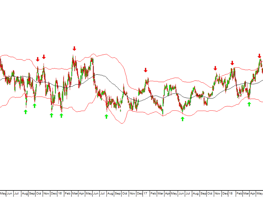
You can see here that this share was in a protracted sideways market, “backing and filling” for many months. The 100-day Bollinger Bands give fairly good buy signals and sell signals (where the green and red arrows are) for someone who wants to trade - and are certainly a good indication of when the share was close to the top and bottom of its range in the sideways market.
However, when the share is at the top or bottom of a cycle it will invariably be close to or outside the upper or lower Bollinger Band. Bollinger Bands should not be used in isolation, but rather in conjunction with other technical indicators to give what is called “confirmation” of a turning point or signal.
Here is another example:
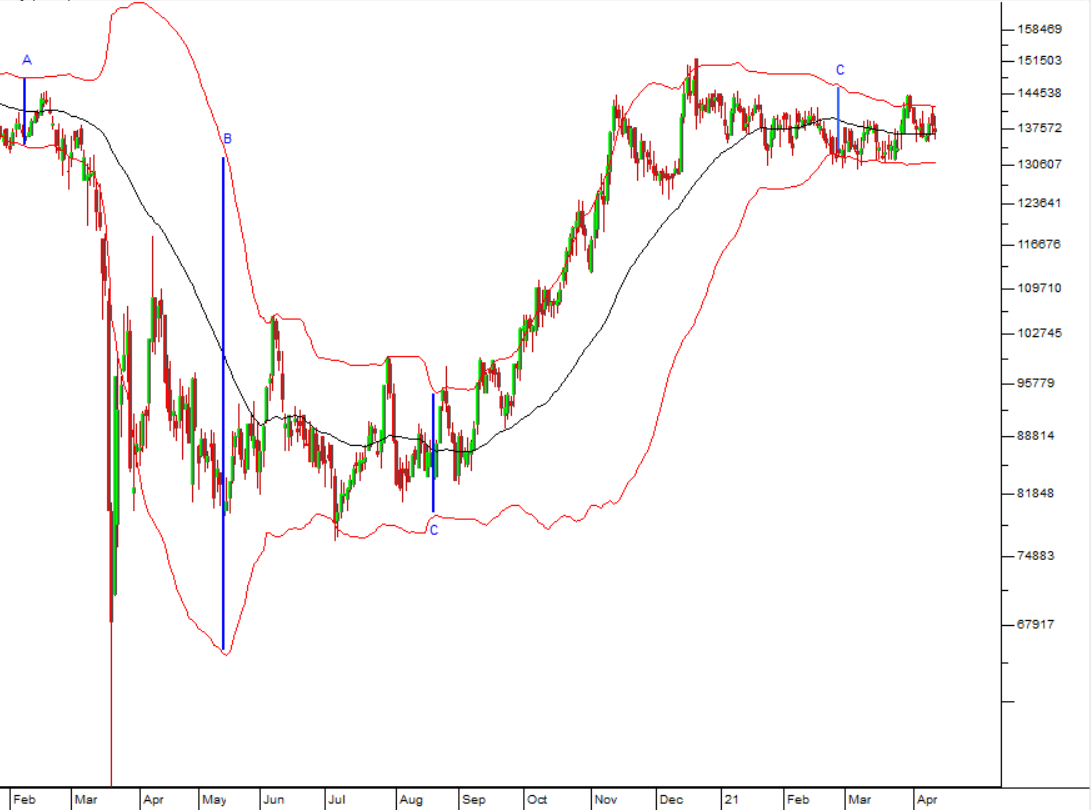
This chart shows the use of a 50-day exponential Bollinger Band on Capitec shares from February 2020 to January 2021. The three vertical blue lines show the gap between the upper and lower Bollinger Bands. You can see that at point “A”, in February 2020, the gap was narrow, indicating a low volatility range for Capitec at the time. The advent of COVID-19 caused the volatility of Capitec to increase sharply by May 2020 shown by the vertical line at point “B”. Since then, volatility levels have returned to “normal” as indicated by the vertical line at point “C”. So, Bollinger Bands can be used to indicate the level of volatility, or more accurately, uncertainty which exists in the market.
You will also notice that when Capitec fell rapidly in response to the pandemic and the lockdown, the share’s price fell well below the lower Bollinger Band – showing just how extraordinary that situation was. Obviously, this was an excellent buy point for those with the courage to act on it. “Black swan” events like COVID-19 are by their nature rare and unpredictable. They are extreme outliers. Bollinger Bands are useful for showing the normal range of trade for a share – and so by exception those places where it is heavily overbought or oversold.
GLOSSARY TERMS:
Warning: mysqli_num_rows() expects parameter 1 to be mysqli_result, bool given in C:\inetpub\wwwroot\newage\onlinecourse\content\lecture_modules_content.php on line 21
List Of Lecture Modules