In module 15 we suggested that the subject of technical analysis (or charting) could be divided into three areas – formations, line charts and wave and cycle theories. In this module we will begin your understanding of the most simple and commonly used line chart – the moving average.
Although all moving averages are automatically calculated for you by your software you should learn how a simple moving average is calculated.
The moving average can help you to decide when to buy and when to sell and it has the great advantage that it smoothes out the fluctuations in the market to reveal the underlying trend.
Your buy and sell decisions are very important to your success in the share market, and there are many different ways to time your transactions - from the highly scientific to simple “gut feel”.
The moving average (MA) technique is the oldest and most widely used of the technical analysis methods. It is by no means the most sophisticated, but it is a good place to begin. It is advisable that you get a good understanding of moving average graphs as soon as possible, because almost everything that you learn in technical analysis uses the moving average in one form or another.
The moving average relies on having a history of daily or weekly share prices (or any consistent financial data stream). Let us suppose that you have collected the following closing prices for a particular share from your newspapers over a period of 20 trading days (6 weeks). Your information looks like this:
| DAY | PRICE | 5 DAY TOTAL | MOVING |
| AVERAGE | |||
| 1 | 3225 | ||
| 2 | 3330 | ||
| 3 | 3400 | ||
| 4 | 3390 | ||
| 5 | 3410 | 16755 | 3351 |
| 6 | 3415 | 16945 | 3389 |
| 7 | 3500 | 17115 | 3423 |
| 8 | 3540 | 17255 | 3451 |
| 9 | 3490 | 17355 | 3471 |
| 10 | 3495 | 17440 | 3488 |
| 11 | 3480 | 17505 | 3501 |
| 12 | 3465 | 17470 | 3494 |
| 13 | 3450 | 17380 | 3476 |
| 14 | 3430 | 17320 | 3464 |
| 15 | 3410 | 17235 | 3447 |
| 16 | 3400 | 17155 | 3431 |
| 17 | 3390 | 17080 | 3416 |
| 18 | 3380 | 17010 | 3402 |
| 19 | 3450 | 17030 | 3406 |
| 20 | 3470 | 17090 | 3418 |
The first column shows the day number, the second shows the prices and the third shows a “moving total” of the most recent five days prices. So, for example, if you add up the prices for days one to five you would get:
3225 + 3330 + 3400 +3390 + 3410 = 16755
Dividing this total by five gives the average price for those five days:
16755 / 5 = 3351 - which is recorded in the column headed "Moving Average" adjacent to the 5th day.
Each day, as you get each new price you can add it to your five-day moving total, subtract the oldest day and then divide by five to get the next moving average. So, on day six you would perform the following calculation:
3330 + 3400 +3390 +3410 + 3415 = 16945
16945 / 5 = 3389
Note that you have added in the price for day six (3415) and left out the price for day one (3225) and so the average has risen slightly. Obviously, you will need at least five days' prices before you can begin to plot a five-day moving average graph. You must plot the moving average value against the last of the days that it includes - so the moving average for the first five days is plotted on the same day as the price for day five - and so on.
This is a graph of the prices and the 5-day moving average for our example:
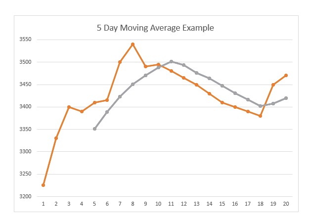
You can see that the moving average graph follows the price chart, running slightly behind it, so that whenever the direction of the price trend changes the two graphs cross each other giving a clear signal. When the price breaks down through the moving average, that is a "sell signal" and vice versa.
In our example, on day 11, the price moved from being higher than the moving average to being lower, giving a "sell" signal and on day 19 it moved from being lower to being higher – giving a “buy” signal. In theory, when the moving average is above the price you should be out of the share and when it is below you should be in the share.
You can use any length of moving average that you want. A 5-day moving average is very short, and most investors use longer moving averages – like a 21-day, a 65-day and a 200-day – depending on how conservative they are.
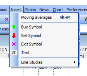
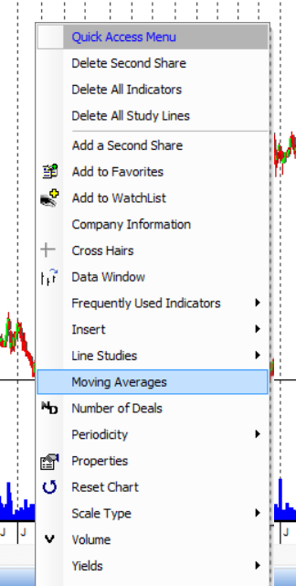
Now let’s do that in your charting software. Put a chart of Pick ‘n Pay on the screen. You can add a moving average to your chart by either going to the insert tab at the top of your screen or by right clicking and then clicking on “Moving averages”:
Once you’ve selected “Moving Averages” you will get a window like this:
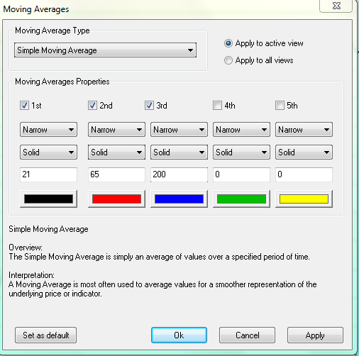
This window allows you to put up to 5 moving averages on any chart (by ticking the boxes) and it will assume that you want at least three (the 1st, 2nd and 3rd). It will also assume that you want these to be a 21-day, a 65-day and a 200-day. Those are the default settings which you can change.
However you can change any of these defaults to whatever you want. Once you have chosen which moving average and length of moving average that you want simply click “Apply” at the bottom of the window and the program will superimpose the moving averages on top of the Pick ‘n Pay chart.
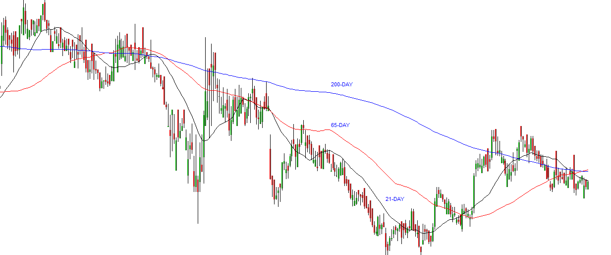
You can see all three default moving averages on this chart – the 200-day (blue), the 65-day (red) and the 21-day (black).
We suggest that you begin with a 65-day moving average and look at many different charts to see if you can identify some buy and sell signals. Spend some time experimenting with various moving averages. You will find that each share has a moving average which suits it best – and sometimes a combination of moving averages can be more effective than just one.
Notice also that you can change the thickness, look and colour of any moving average line.
WHY DOES IT WORK?
In Module 15 we suggested that technical analysis is a social science, like economics and psychology, because it is the study of group investor behaviour. We talked about the importance of establishing the particular behaviour of the indicators that you choose to use. In the case of the moving average this is relatively easy.
The moving average works because people have difficulty in adjusting their perceptions of the value of an asset quickly. For example, if you were holding a share which was trading in the market for R20, would you sell it tomorrow for R1?
Certainly not! And nor would anyone be stupid enough to offer you R1 for it. But if it was over-priced at R20, then it is quite conceivable that you would accept R19 for it. And if you were still holding it the next day, you might accept R18. In time it might eventually reach R1, but it would never do so in one day. It would take weeks and months – which means that mathematically, the price must cut down through its moving average and you will always have time to sell.
Once you understand this, you can easily see why the moving average works because while it is possible for a share price to go from a peak of R20 to a low of R1, it will never do so in one day. Mathematically, it must cut down through its moving average giving you a “sell” signal – and, if the share is free dealing, you should always have time to sell.
Probably the most common stumbling block in the market is subjectivity. We are all swayed by the opinions of so-called “experts” and, more than that, we naturally feel disappointment when we lose money and elation when we make it. We covered this reality in Module 16.
These subjective influences should never be allowed to interfere with the cold objective facts in your charts. When the daily price breaks down through the moving average, don’t listen to stories about the oil price or the U.S. inflation rate - just sell your shares!
You will find that suddenly the reports begin to become more bearish - only after the share has started to move down. This is because the smart money will always tend to move out before bad news is published.
The moving average is a very crude indicator - it does not tell you which share to buy; it does not always get you into the share early enough; it often gets you out too late; and it does not help you in a sideways market. But studies on the Dow Jones index over more than 100 years indicate that an investor using a 200-day moving average and buying and selling on all the moving average signals would do 10 times as well as an investor who simply bought and held the index over the same time period. So, crude though it is, the moving average does work.
The disadvantages of the moving average have been addressed with varying degrees of success by other indicators and techniques which you will learn about in these modules. The plain moving average, however, remains a widely-used method of monitoring trends in the market and identifying major changes in those trends.
AN EXAMPLE FROM THE MARKET
Allied Electronics Corp, or Altron, is an information and communications technology company which was started by Bill Venter in 1965, and operates in six African countries as well as the UK and Australia.
Technically, this share price fell from a high of over R28 in mid-2014 to a low of under R5 in November of 2015. It then made what technicians call an “island formation” and broke on the upside in October 2016. A simple 250-day moving average has been superimposed on the chart below showing the buy and sell signals.
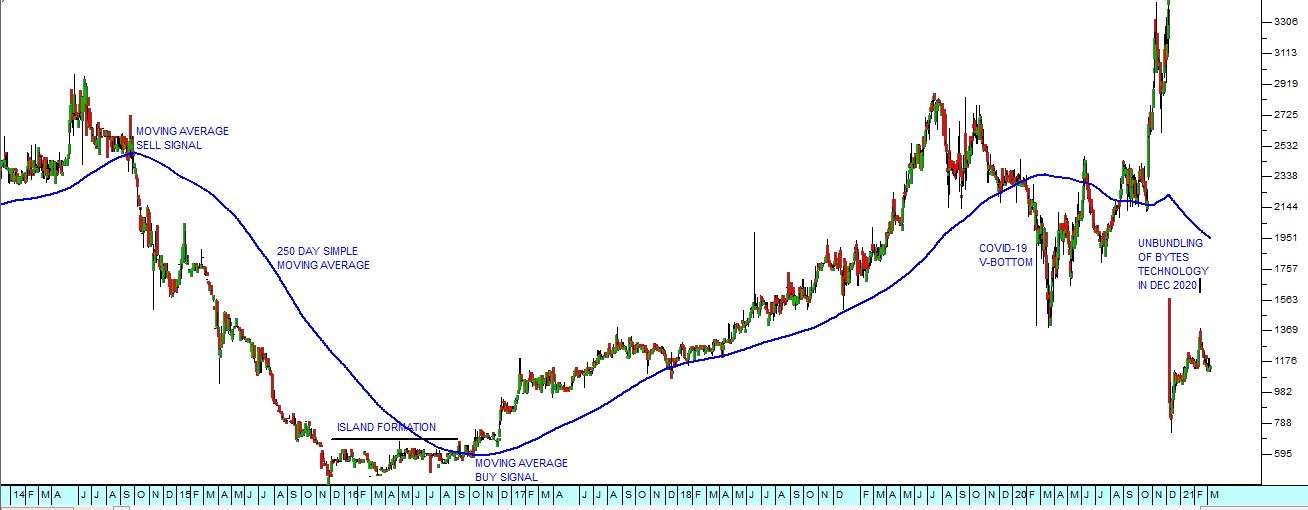
Looking at this chart you can see that the 250-day moving average gave a clear sell signal in September 2014 and then the share fell substantially before making an “island formation” for most of 2016. Then in October 2016 it broke up out of the island and the 250-day moving average gave a clear buy signal. The share entered a strong upward trend which was finally broken in March 2020 by the COVID-19 pandemic. We regard the pandemic as an aberration for the purposes of technical analysis because it was not caused by an economic factor but by an unpredictable “black swan” event. The share recovered strongly from the lows of March 2020 and the bull trend resumed. Then in December 2020, the company unbundled and separately listed its major subsidiary, Bytes Technology, which caused the “cliff” in the chart.
Below is a video explaining the moving average and how it is calculated. Next we look at the different types of moving averages.
GLOSSARY TERMS:
Warning: mysqli_num_rows() expects parameter 1 to be mysqli_result, bool given in C:\inetpub\wwwroot\newage\onlinecourse\content\lecture_modules_content.php on line 21
List Of Lecture Modules