One of the earliest and most intuitive aspects of technical analysis is the recognition of formations. A formation is a particular pattern which appears from time to time in charts of share prices, indexes and all continuous financial charts. This pattern becomes associated with a specific future outcome – which can then be used to make profitable trades – or to influence your decisions about transaction timing.
At any point in time there are both bulls and bears in the market for any security – the one is optimistic and thinks that the security will rise, while the other is pessimistic and expects the security’s price to fall. If there are more bulls than bears, the market will rise and vice versa. If the bulls and bears are more-or-less equally matched then the market will move sideways until the future direction becomes clearer. During a strong upward move about 80% of investors are bullish and only 20% are bearish – and vice versa. So the share price pattern is dominated by either bullish or bearish sentiment separated by periods of uncertainty when the market moves more-or-less sideways.
In module 21 we showed the chart of a security in a strong downward channel – bounded by two parallel trend lines. Upward and downward channels like that are common in the market, but they are usually interrupted or terminated by some kind of known formation.
There are dozens of formations that have been recognised and documented. In this module we will just consider the most commonly known.
V-TOPS AND V-BOTTOMS
Occasionally, a share will make a very sharp and rapid reversal – usually because of some sort of significant market intervention or sentiment excess – like an excessive injection of funds into the economy. This leads to a V-shaped turning point. Look at the chart below:
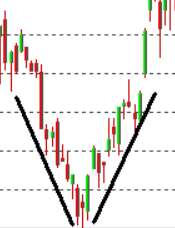
What is significant about this chart of a V-bottom formation is the sharp reversal of sentiment from bearish to bullish almost from one trading day to the next. The sharpness of the turn makes the change in direction difficult, if not impossible, to predict. There is no slowing down or gradual shift in sentiment which could be used as an early warning.
V-bottoms are unusual and often associated with some type of entirely extraneous factor entering the market. This what happened in March/April of 2020 when the COVID-19 pandemic impacted the markets. Consider the chart of the S&P500 index from Wall Street going back to the start of the current bull trend:
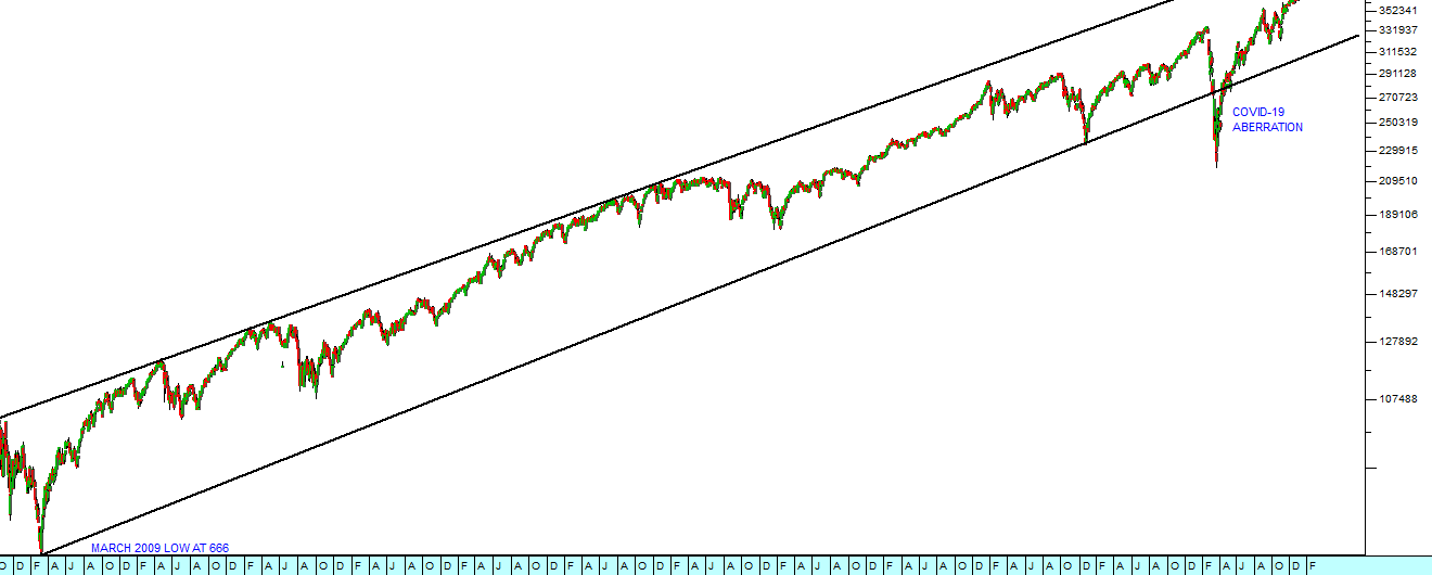
You can see here that the bull market began in March 2009 at an index level of 666. It persisted for 11 years and was interrupted by the COVID-19 V-bottom. We view this as a technical aberration because it did not arise from normal economic events, but rather from a “black swan” event in the form of a pandemic.
The V-top is the opposite way around:
Bullish sentiment suddenly runs out of steam and the sellers overwhelm the buyers causing the price to fall sharply. There is no sideways period of uncertainty. V-tops and bottoms are usually characterized by the steepness of the trend as it approaches its turning point. Ideally, the technician would prefer a slower rise or fall to give more time to anticipate the turning point.
It should also be noted that the smart money usually sells out well before the top of the trend and buys in well before the bottom. This is because they prefer to trade when there are plenty of counter parties to take up the other side of their trades. They do not enjoy chasing a share down when they are trying to sell it or up when they are trying to buy it. This early trading of the smart money underlies some of the formations which we will consider below.
UMBRELLA/SAUCER TOPS AND BOTTOMS
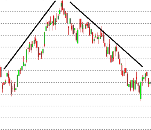
This is the opposite of a V-top or bottom. In an umbrella top, the market drifts out slowly, losing momentum steadily as bullish sentiment gives way to bearish sentiment. The opposite is true of the umbrella bottom (saucer bottom). Consider the following chart:
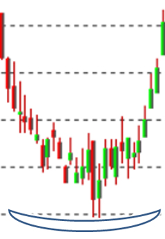
Here you can see how the share was falling steeply and then gradually the downward movement began to lose momentum, flattened out and then just as slowly began to rise. Momentum indicators are useful with umbrella bottoms and tops because they measure the loss of momentum and actually sometimes give advance warning of the turning point. The umbrella top is the opposite formation where the share loses rising momentum and then slowly tops out before beginning its descent. Consider the chart:
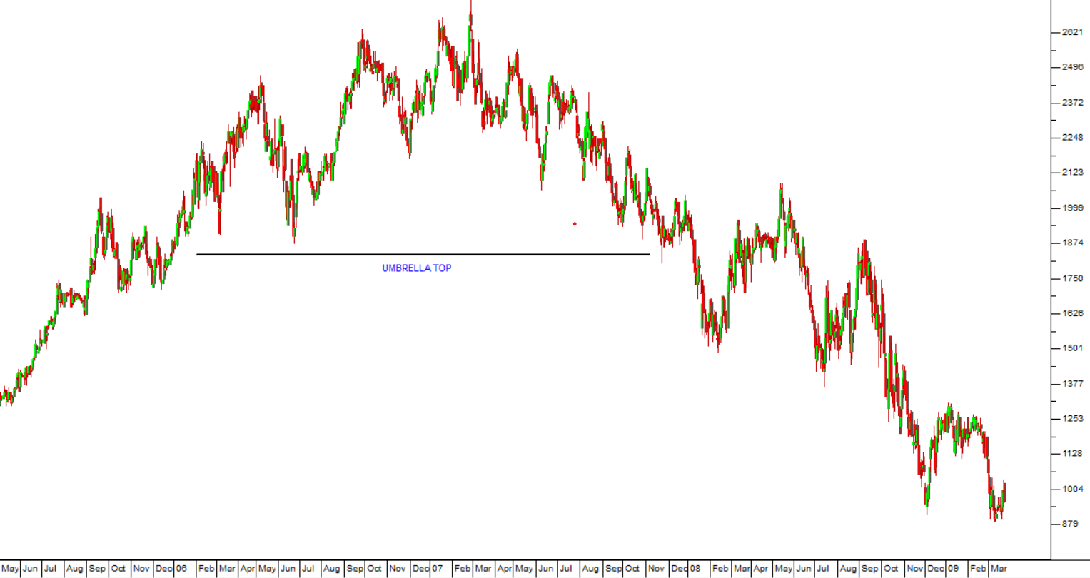
As you can see this share took an entire year to "top out" and then begin its descent.
MULTIPLE TOPS AND BOTTOMS
Double tops and double bottoms are fairly common in the share market and offer an excellent indication of a change of direction. When the price chart is in an upward trend and reaches a high point and then falls back, its next challenge is to rise above that point. If it rises to that point and then falls back without breaking above it, there is obviously a lack of strong support above that price and it will usually fall back sharply. Double tops indicate a loss of confidence and double bottoms indicate an increase in confidence, because a floor price has been found indicating some significant support. Consider the chart:
Here you can see that the share reached a high point from which it fell back quite significantly, finding support at a lower level. From that support it rallied and made a second attempt to penetrate the previous high. Its failure to penetrate that level saw all confidence evaporate and the share fell heavily. Note the process whereby bullish sentiment gave way to bearish sentiment. When a share has been in a strong bull trend for some time, there will always be a residue of investors who do not believe that it has reached its highest point. It has been well said that hope is the last thing to die. The failure of the second top to move above its previous high should be a clear warning that a major downtrend is imminent.
The opposite is true for a double bottom. Investors who are watching a share that has fallen significantly are naturally waiting for it to reach its lowest point so that they can buy in. Typically at such a time all the news about the share seems to be negative. Then the fact that it finds support at a certain price level will act as an enormous boost to the confidence of the bulls – causing the share to rise quickly off its double bottom. Consider the chart:
Very occasionally you will see a triple top or bottom. Such formations are quite rare and simply indicate the change of direction with much more force than the double variety. Of course, more bottoms or tops at a particular price level would indicate strong support buying or strong resistance selling at that level.
HEAD AND SHOULDERS
In the head and shoulders formation the share rises strongly to a new high before going through what looks like a correction where it falls back to lower levels. This is the “left shoulder”. Renewed enthusiasm then takes up to a new record high, usually well above the left shoulder – which makes the “head”. However it falls back from that high towards the low that it made after the left shoulder. Finally there is one last rally which takes the price to a point close to the high of the left shoulder, but still noticeably below the head. That is the right shoulder. A line drawn to connect the low after the left shoulder with the low after the head is called the “neckline”.
Consider the following chart:
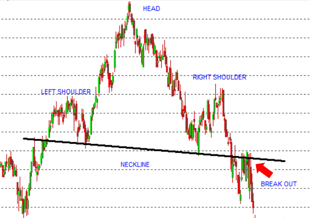
Typically, the “smart”money wants to get out of a rising trend long before it reaches its highest point so that they can sell into strength rather than chasing a falling market down. It is their selling which causes the left shoulder. Once they are out of the market, other bullish investors drive the market up to the peak of the “head” before running out of steam. The share then falls back to the “neckline” before a group of “stale bulls”, who cannot accept that the bull trend is over, take the share price back up, to form the right shoulder. Once the right shoulder is complete, the share price falls back and breaks below the neckline to give a classical downside “break-out”.
The head-and-shoulders formation is a very powerful indicator of a downward trend. The problem is that until it has made the head and is falling it is difficult to see that it exists. One of the signals is the extent of the fall following the head. If that low is lower than the low which followed the left shoulder then odds are strong that you are watching a head-and-shoulders forming. Until that point it can look like a perfectly normal correction within a bull trend.
It is also sometimes possible to get a reverse head and shoulders formation after a share has been falling for a long time. Reverse head-and-shoulders formations are quite rare, but when they do occur they indicate a strong upward trend.
FLAGS, RECTANGLES, PENNANTS AND TRIANGLES
These are all formations which generally occur inside a larger bull or bear trend. They basically consist of various periods of relative uncertainty or “breathing spaces” within the underlying trend. Consider the following chart which shows a typical rectangle formation:
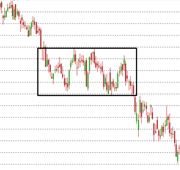
Here you can see that the share’s price is in a clear downward trend and the rectangle (indicated by the box) is an interval of sideways movement. As you can see, the price moves between upper and lower trend lines (resistance and support lines) often because there are major sell and buy orders at these levels. Sooner or later the buy and sell orders are fulfilled and the downward trend resumes.
A triangle indicates a period of falling uncertainty. The price begins by moving very sharply, first up and then down. Each successive move is smaller than the previous move, as the uncertainty resolves itself. Finally, the triangle is broken and the underlying trend re-asserts itself or a new trend begins in the opposite direction.
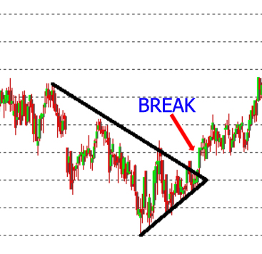
The above triangle takes place between rising and falling trend lines, but sometimes either the upper or the lower trend line is horizontal. In a rising triangle the upper trend line is horizontal and in a falling triangle the lower trend line is horizontal. Rising triangles usually break on the upside, while falling triangles usually break down.
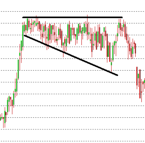
The opposite of a triangle is a broadening formation where the range between the upper and lower triangle gets wider and wider, indicating that market uncertainty is increasing rather than decreasing. Broadening formations are very rare and offer very little predictive information beyond the fact that the trend will normally continue in the direction of the break.
A flag or pennant formation is similar to a triangle, the difference being the length of time it takes to form the formation, and that a flag is a continuation signal rather than a trend reversal signal. A flag will form over a very short period, usually between 1 to 3 weeks. A triangle, on the other hand, can last up to 6 months or longer.
ISLAND
At the bottom of a long downtrend, there is often a period of sideways movement before the new upward trend begins. This is known as an “island”. Consider the chart:
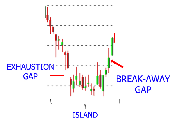
As you can see, before the island formation the share is falling rapidly and often shows an “exhaustion gap”. This is where the price opens at a lower level than the previous day’s close – indicating that investors have reached a point of “capitulation” and will take any price for their shares. The opposite of an exhaustion gap is a “break away gap” where great enthusiasm causes the share to open above the previous day’s close.
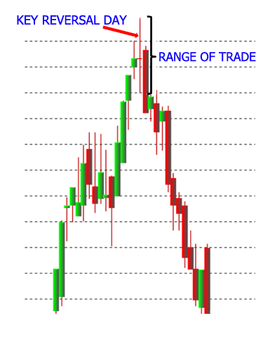
KEY REVERSAL DAY
Often, at the top of a long upward trend, there is a day where the range of trade (i.e. the gap between the high and low of the day) is far greater than usual. This is a “key reversal day” and usually signals the beginning of a downtrend. The wide range of trade indicates the significant differences of opinion between the bulls and the bears and their determination to stick to their position. Consider the chart below:
There are any number of formations. What we have covered in this module are just the most common ones. Make a habit of looking for formations in your charts. You will be surprised how often they come up and the extent to which they can help you to make good decisions in the market.
Examples of Formations in the Market
Learning from Steinhoff
The Steinhoff debacle contains some vital lessons for private investors.
Their restated financials reveal a web of companies which were used by a group of unscrupulous executives to move money around, overstate profits and obscure fraudulent transactions.
Clearly, the investing public and even the highly-qualified and experienced analysts at various asset management companies like Coronation, Allan Gray and the Public Investment Corporation (PIC) were fooled into thinking that Steinhoff was a solid blue chip company which was growing rapidly.
Steinhoff’s financial results were analysed exhaustively. Steinhoff executives were interviewed and questioned about various aspects of the business. Auditors did numerous spot checks of the figures and wrote clean audit reports. Nobody realised until it was too late that the structure and the published results were just “smoke and mirrors”.
How can a private investor with limited time and resources protect himself against this type of cataclysm?
The answer lies in the charts.
Every company has insiders who will always know more about what is really happening than you can. Those insiders will always trade on their superior knowledge before the facts are revealed to the public. Their trades will impact the share’s chart in specific ways which are clearly visible to the alert investor.
Let us consider the example of Steinhoff and what its chart revealed long before its ultimate collapse:
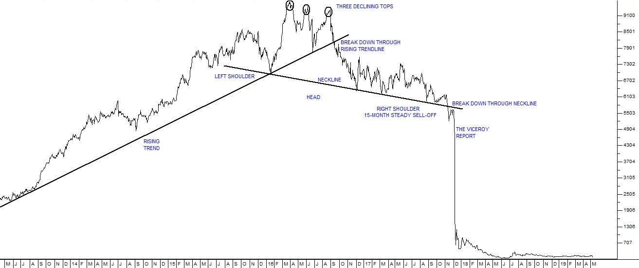
You can see here the meteoric rise of Steinhoff until March 2016 when its share reached a peak of 9685c. The share was a “market darling” and everyone was buying it – especially the big institutional investors.
Then something happened which should have alerted anyone who was watching the progress of Steinhoff’s upward trend. It made a “lower top” at 9479c on 7th June 2016. The share went up and attempted to exceed its March 2016 high – and then failed. This failure was followed (as it usually is) by some disappointment and the share fell back to lower levels.
Then in August 2016, investors built up their courage to try again. But this time the share could only reach 9360c before it fell back. A second failure created a declining “triple top”. This is probably one of the most negative and bearish of all technical formations in charting. Anyone who was the least acquainted with the basic principles of charting would have been aware that Steinhoff was about to fall – and so it did.
Fund managers are, however, stubbornly loyal to the idea that audited financials are reliable indicators of a company’s future performance. Indeed their entire training leads them to be so. But somebody inside Steinhoff already knew the truth and was busy off-loading a substantial portfolio of shares. Whenever the share reached high levels above 9000c that insider sold off another large chunk of shares – which were enthusiastically taken up – mostly by institutional investors.
There followed a period of about 15 months during which the share drifted down before the publication of the Viceroy report, the acknowledgement of “accounting irregularities”, and the resignation of Marcus Jooste as CEO brought the illusion to an abrupt end. The share collapsed from 5500c to less than 500c.
A person familiar with technical analysis will notice that after this third lower top, the share broke down through its long-term upward trendline – a clear sell signal. They would also have noticed that a massive long-term “head-and-shoulders” formation was becoming apparent. Conventional technical wisdom is that a break below the neckline is the final signal of the coming bear trend. This break occurred on 10th November 2017 – when Steinhoff was trading for 5600c. Shortly after that it collapsed by more than 90%.
You should take your time to study exactly what happened to Steinhoff and how you, as a private investor, could have avoided being a victim.
EOH
Another startling collapse of a blue chip share, similar to Steinhoff, was EOH. Both these highly regarded shares had been falling for some time and then experienced a sudden unexpected collapse. EOH made a very convincing “double top” with peaks at R178 on 6th August 2015 and then at R175 or 3rd October 2016. The failure top in December 2016 showed that the share was unable to break above the previous two highs and this was a fatal sign. Any investor holding these shares should have sold out then.
Consider the chart:
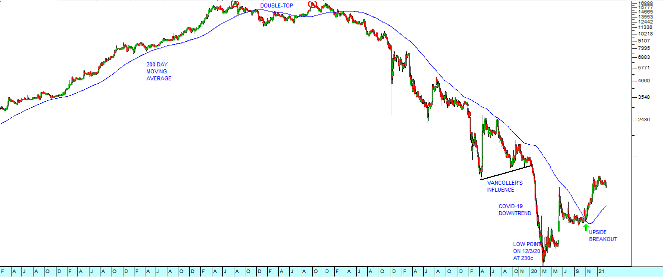
The resignation of long-time CEO Asher Bohbot of EOH in June 2017 came well after the ominous double top and obviously, anyone using a stop-loss strategy would have been well clear of the share by then. The share fell steadily, breaking below its January 2016 low of R125 in July 2017 (a sure signal for anyone watching the chart). But none of this would have prepared us for the drop from R80 to as low as R26.55 four days later. Apparently there were questions about how EOH has been able to land profitable government contracts which were being investigated by the Independent Police Investigative Directorate. A new CEO, Stephen van Coller was appointed in about March 2019 and began to have and was beginning to have an impact when COVID-19 struck. It ultimately fell as low as 230c in March 2020 before beginning a recovery.
The point is that as a private investor, even if you canvass everything which is published, you will probably not have enough information to make a sound decision. Your only real hope is to follow what the insiders are doing in the charts.
GLOSSARY TERMS:
Warning: mysqli_num_rows() expects parameter 1 to be mysqli_result, bool given in C:\inetpub\wwwroot\newage\onlinecourse\content\lecture_modules_content.php on line 21
List Of Lecture Modules