In module 15 we introduced you to the idea of technical analysis or charting as it is known – the idea that share prices move in patterns which can be used to improve the timing of our transactions. In this module we will look at trend lines and how you can use them in the market.
A trend line is a straight line which connects two or more tops or bottoms in order to suggest a trend. The more tops or bottoms which are connected, the more reliable the trend line becomes as an indicator of the future trend and the more important any eventual break through the trend line becomes. Consider this chart of the rand:
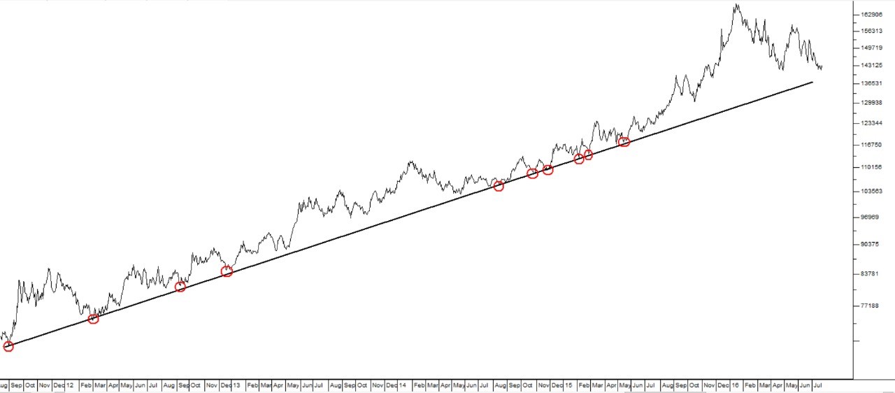
You can see in this chart, the rand against the US dollar over a period from 1st September 2011 to 15th May 2016. You can see that it was possible to establish a trend line connecting the lows over an extended period of about five years. This trend line is supported by no less than 10 touchpoints (highlighted by the red circles) – which makes it a very reliable trend line. Accordingly, when the rand weakened more sharply against a strengthening dollar in the middle of 2015, it was possible to predict that it would probably strengthen again in due course, to come back to this underlying support trend line at some point in the future.
It was also possible to calculate that the rand was weakening at a predictable rate of roughly 0,54c per trading day on average. This calculation is made by taking the first touchpoint on 1-9-2011 at 697c to the dollar and the last touchpoint on 15-5-2015 at 1177c to the dollar. So that is a decline of 480c in three years and eight months – or about 968 trading days – which is about 0,50c per day. Then this rate of decline can be extended into the future to determine the probable exchange rate at any future date. For example, by the beginning of 15th May 2016 ( a year after the last touch point), the rate should have been about 1309c to the dollar (12 months after the last touch-point - or 264 trading days at 0,50c per day plus 1105c). The fact that it was actually at around 1553c indicated that it was heavily under-valued (by about 1553c – 1309c = 244c) against the dollar and due to significant further weakness in January 2016 ( to 1647c to the US dollar) and then rally back towards the underlying trend line.
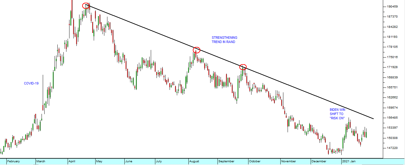
Looking at the rand against the dollar in 2020 we can see that since its weakest point of just under R19 to the US dollar in April it has been on a strengthening trend which is now identified by three touchpoints (the red circles). You can also see the devastating impact of the virus on the rand as international funds shifted rapidly from “risk-on” to “risk-off” as a result of COVID-19:
The problem with trend lines is that they are not often this reliable because they do not make as many touch-points. Typically, when a technical analyst sees a trend line with three touch-points he becomes excited and begins to make predictions based on it – and much depends on exactly where you choose to put the trend line. One point that all technicians would agree on, however, is that trend lines are precise. Touch-points are often slightly higher or lower than they should be so there is some room for interpretation. But, despite this, it is surprising how often trend lines are a very good indicator of future trends and especially of a change in the direction of the trend.
CHANNELS
Shares often move within a clear channel defined by two parallel trend lines. Consider this example:
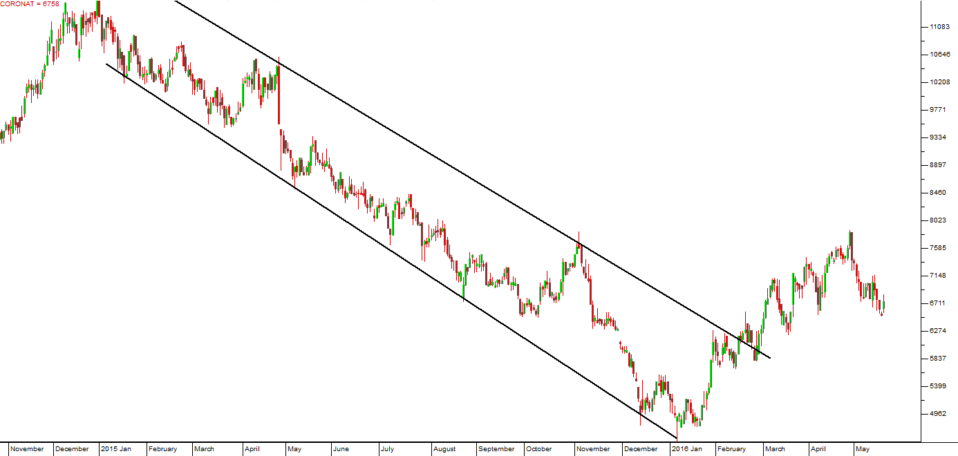
Here you can see that this share moved within a fairly well-defined channel for a period of about one year. Note that the upper trend line connects just two tops, but that it is more-or-less parallel with the lower trend line which connects as many as five bottoms. Obviously, the two trend lines can be drawn slightly differently from this, but the essential point remains valid. This channel was very useful in predicting the new upward trend which began when the upper trend line was broken towards the end of February 2016. A “buy” at this point would have yielded good profits.
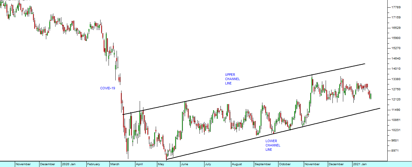
The following chart of Standard Bank shows how, after the fall due to COVID-19, the share began to appreciate steadily as confidence levels returned. This resulted in a steady upward channel.
SUPPORT AND RESISTANCE
Sometimes, when there is a period of uncertainty in the market, a share or index can oscillate up and down between two parallel, horizontal trend lines – known as support and resistance levels. A support level comes about because one or more large buyers have placed orders to buy at a particular level. Whenever that level is reached the buy orders are kicked in and the share reacts positively. Conversely, a resistance level occurs where there are large sell orders at a particular price which are triggered as soon as the price reaches that level, knocking it back down. Typically, then, the share can oscillate between the support and resistance level until one or the other runs out of orders and the level is broken in what is known as a “break-out”. Consider the following example:
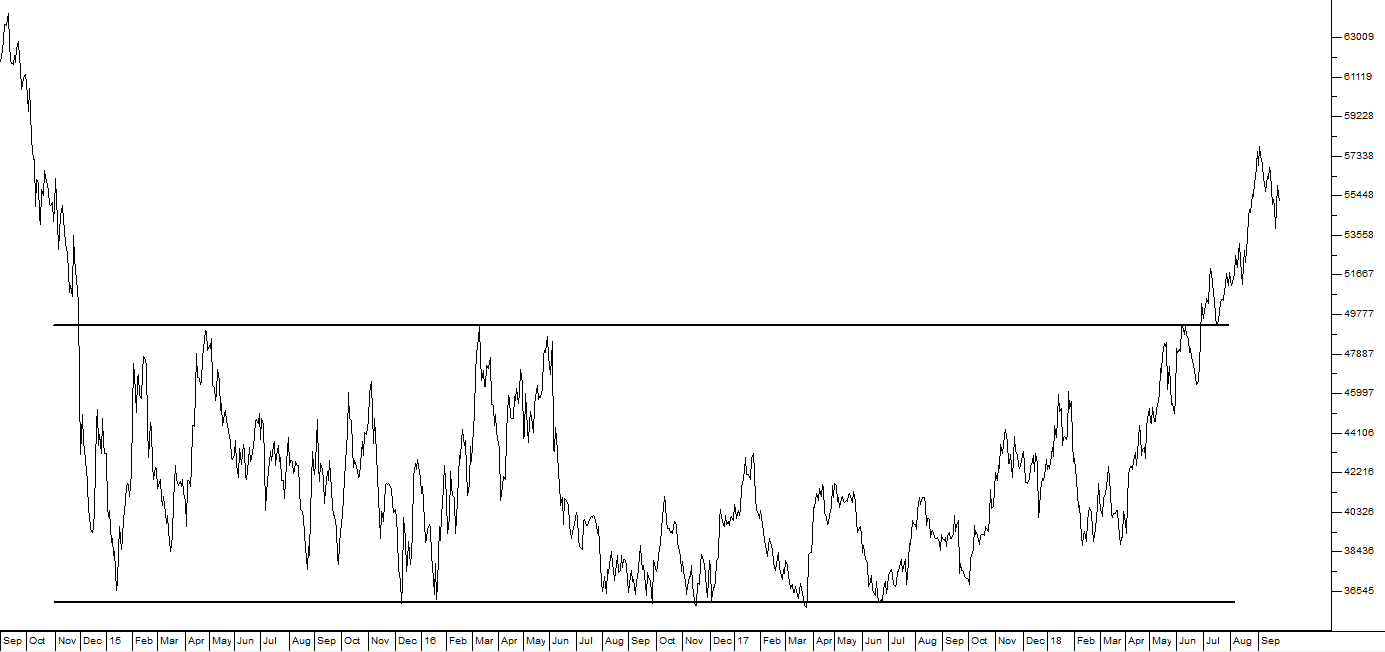
Here you can see that this share entered a period of “sideways” movement after a significant fall where investors were more-or-less equally divided over its probable future course. Every time the share reached a price of around R490, it fell back as sellers entered the market. However, as soon as it fell back as far as R360 per share, buyers came in who pushed the price back up. Now, obviously, any break above the resistance at R490 would signal a new upward trend, while a fall through R360 would signal a resumption of the bear trend.
Now consider this example of the JSE- Overall index for the 4 years from the start of 2017 to the beginning of 2021:
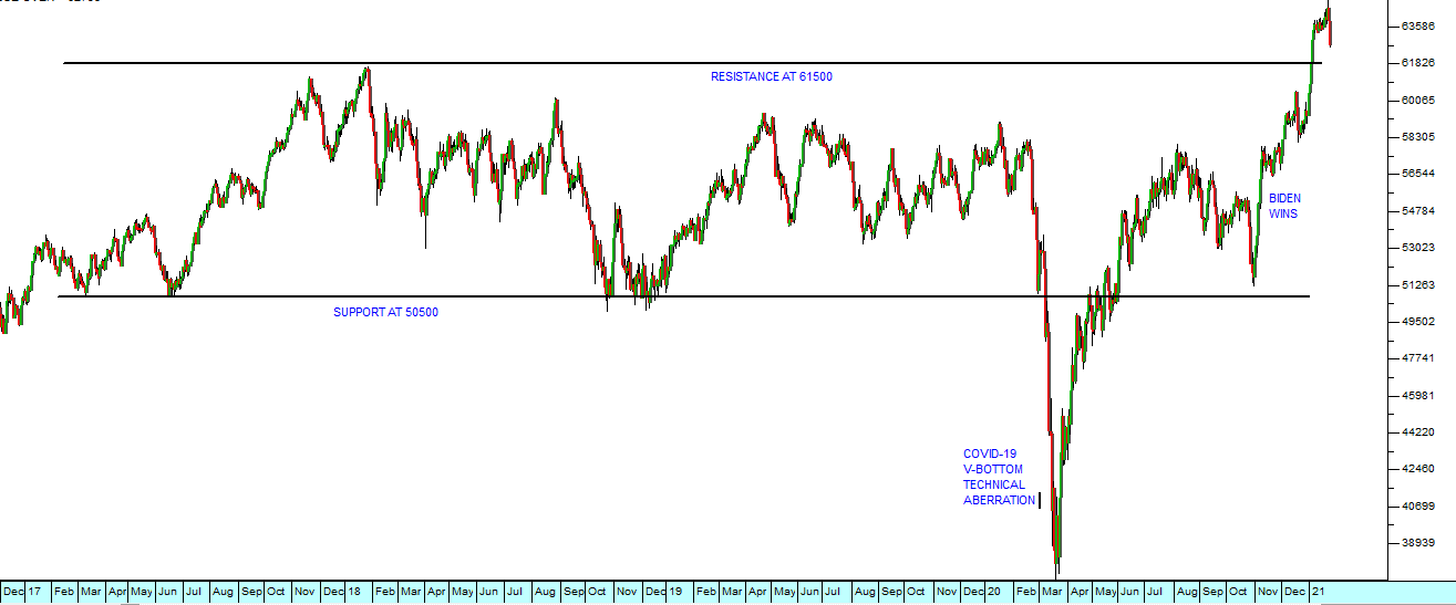
You can see that the JSE Overall index (a weighted average of all the shares trading on the JSE) oscillated between resistance at about 61500 and support at 50500 for this four year period. The sideways pattern was broken by the COVID-19 “V-bottom” in March 2020, but we regard that as an aberration from a technical perspective and so we ignore it for this analysis. You can see that following the Biden presidential win in America, the JSE Overall index moved rapidly towards the resistance level. Once that is broken, we can expect a strong new upward trend to develop.
Your software allows you to put as many trend lines as you want to on any chart and then to save your work so that it will be there when you open that chart again. You need to experiment and try different ideas, but you will be surprised at how effective trend lines can be despite the fact that they are one of the simplest ideas in technical analysis. Do not be tempted to put dozens of trend lines onto a chart so that it looks like a spiderweb. Keep it simple.
AN EXAMPLE FROM THE MARKET
Vodacom is the largest supplier of cell phone connections in South Africa with 43.2 million local customers at the time of writing. It also has over 30 million customers outside South Africa. In its results for the year to 31st March 2019, the company reported turnover up 4,3% and service revenue up 5%. Total subscribers were 110m - up 5,6%. Vodacom is owned about 65% by Vodaphone.
By anyone’s standards, this company is a blue chip. Most of its income is in the form of annuity income and it has a relatively low working capital requirement because it is a service company. It does have some exposure to union action, but appears to have that well under control. It is consistently profitable and is benefiting from the explosion of smart phone usage in South Africa.
Vodacom has always been relatively poorly rated compared to other blue chips on the JSE. It consistently trades at a dividend yield of between 4,5% and 5%, probably because its business depends heavily on new technologies and it is well-known that revenues from voice are declining while revenues from data are increasing.
From the beginning of 2010 until around October 2016, it was in a strong bull trend with a long-term upward trendline, supported by many touchpoints. Consider the chart:
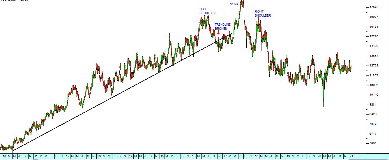
That trendline was first broken on 4th October 2016 giving investors a signal to sell out. As it turned out, Vodacom was in the throes of a head-and-shoulders formation, which is one of the most bearish formations (you will learn about formations in Module 22). However, as you can see from the chart, selling out in October 2016 would have been a wise decision.
It is in this example that the importance of trendlines comes to light. As you can see, the trendline extends from March 2010 to October 2016, in which time the share gained 157%. Since the trendline was broken on the 6th November 2017, the share has fallen to current lows at around R124, down nearly 16% so far and a private investor would have done much better placing their funds elsewhere.
GLOSSARY TERMS:
Warning: mysqli_num_rows() expects parameter 1 to be mysqli_result, bool given in C:\inetpub\wwwroot\newage\onlinecourse\content\lecture_modules_content.php on line 21
List Of Lecture Modules