“Investing in shares is an art, not a science, and people who’ve been trained to rigidly quantify everything have a big disadvantage”.
(Peter Lynch)
THE TREND IS YOUR FRIEND
In general, it is good advice to buy shares which are rising, in sectors which are rising and in markets which are rising. Markets typically oscillate from being in a bull market to being in a bear market and back again. A bear market can last anything from 18 months to 3 years or longer and bull markets can last for ten years or longer - but are usually at least three years long. A bear market will usually take the market down by 50% or more – so it is something you want to steer well clear of. During a bear trend about 80% of shares or more are falling. They are falling not because there is anything directly wrong with the company they represent, but rather because the market as a whole is bearish. In a bear market, you can buy a good share and still lose money – because sentiment is generally negative and the whole market is falling. For this reason, you need to be completely out of the share market during a bear trend.
The opposite is true for a bull trend. When sentiment is bullish, 80% of shares are rising. Even if you choose the wrong share, the market will probably come to your rescue in due course. So, during a bull trend you want to be close to 100% invested.
For these reasons it is very important as a private investor to be able to determine whether you are in a bull market or a bear market at any point in time and to have a reliable mechanism that will tell you when the market switches from bull to bear or vice versa.
To determine whether the market as a whole is in a bull trend now you will need to look at its index. The JSE is an unusual share market because it has an unusually heavy weighting of mining companies – all of which are "commodity shares" and generally need to be avoided (especially by beginners) because of their relative volatility and unpredictability. It is also dominated by a few very large companies like Naspers (NPN), Richemont (CFR), Anheuser Bausch (ANH) and British American Tobacco (BTI) which have most or all of their investments overseas.
For this reason, it is better not to look at the overall index which is often skewed by sudden unrelated bull and bear market trends in commodities or a sudden unrelated move in Naspers. If you take the commodity shares out, you can get a good idea of what is happening to the rest of the market by looking at the JSE-FIN30 – but this still includes overseas companies. This index is quite similar to the JSE-IND25 except that it also includes various large banks, insurance companies and other financial institutions.
One way to establish whether this index is in a primary bull or bear trend is to put on a long-dated moving average – say a 300-day moving average (MA) and look at its slope – like this:
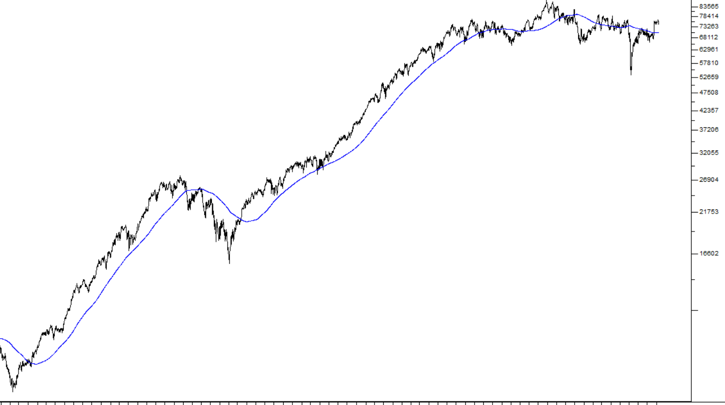
The smooth blue line is the 300-day moving average.
To do this in the ShareFriend Pro software, open the JSE-Fin30 chart on your screen, right-mouse anywhere on the chart, which will bring up the right click menu and you will see an option for “moving averages”. This window allows you to put as many as five moving averages onto any chart – black, red, blue, green and yellow. If you just click “Apply” at the bottom of this window, your program will add a black 21-day, a red 65-day and a blue 200-day moving average to your chart. You can change the periods of the moving averages to suit you.
Look at the 300-day moving average in the chart above. As you can see, it is mostly sloping upwards with each day’s moving average higher than the previous. When it is doing this, it is in a bull trend (even if the index temporarily breaks down through it). So, if the long-dated moving average is rising, you can generally assume that the index is in a bull trend – and vice versa.
This method of determining whether the index is in a bull or a bear trend is not an entirely fool-proof approach. Sometimes you will see that the 300-day MA turns downward, only to reverse itself a month or two later and resume its upward trend in what is called a “whip lash” – but one thing that you will learn about the share market is that even the most reliable rules are perhaps only right 75% of the time.
And remember, you can always work with the length of the moving average. So, a 350-day moving average will give you less “whip-lashes” – but it will also give you later signals of a change in the direction of the trend than a 300-day. So, the length of the moving average that you choose will always be a compromise.
The moving average is explained in module 23 and module 24.
THE S&P500
With the advances in communications and technology over the past century, the stock markets of the world generally move together – and they all tend to follow the US market on Wall Street. This market has a number of indexes such as the Dow Jones – but the best average and the most representative is the S&P500 index. This index is a weighted average of the performance of the 500 largest companies trading on Wall Street. If these 500 shares are in an upward trend then you can be fairly certain that all the other markets of the world – London, Paris, Tokyo, Hong Kong and the JSE – are also in a bull trend. The opposite is also true. So, we recommend that you use the slope of a long-dated moving average on the S&P500 to tell you whether the market is in a bull or a bear trend.
Consider the following semi-log chart of the S&P500 with a 300-day simple moving average (blue) superimposed:
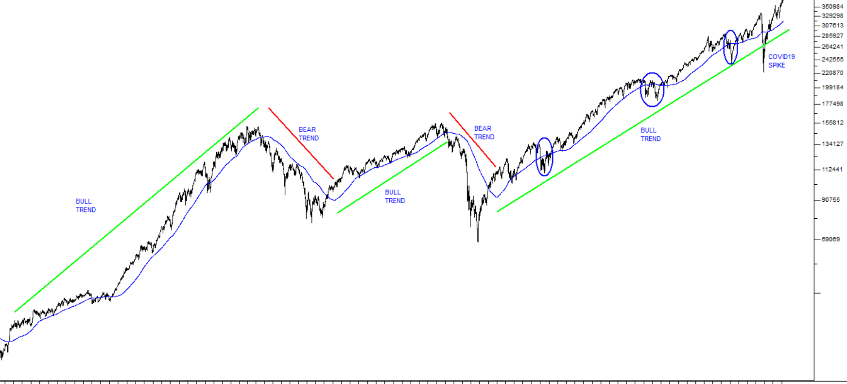
This shows the S&P from October 1990 to December 2020 – a period of 30 years. The 300-day moving average (in blue) has smoothed out the underlying volatility to reveal clearly the long-term bull trends (shown by the green lines) and bear trends (shown by the red lines). You can see that the change in the slope of the 300-day moving average has signalled the shift from bull to bear and vice versa quite reliably over this long period.
At the same time, watching that slope has allowed you to ignore some very big corrections – which are highlighted in the current bull trend by the blue circles. This is important, because whenever the market enters a correction it can be very difficult to know whether it is the start of a bear trend – or just a good “buying opportunity” within an overall bull trend.
This chart shows the impact of COVID-19 on the S&P500 in the second quarter of 2020. It caused the index to spike downwards – but the move was very short-lived because of massive fiscal and monetary stimulation in the US and because investors generally felt that the virus had not fundamentally disturbed the underlying bull trend. The COVID-19 downward spike was, in our opinion, an aberration from a charting perspective – and you will note that it had no significant impact on the 300-day moving average.
Of course, you can use a shorter or longer moving average than the one which we have chosen here. Longer moving averages will be more reliable, but their signals will come later. Shorter moving averages will get you in and out more quickly, but with a greater danger of being whip-lashed. You can also look at smoothing your moving average in various ways. Your software allows for simple, exponentially smoothed, time series, triangular, variable-length and weighted moving averages (explained in modules 23 and 24) - which you may prefer.
The main point is that when the slope of your long-dated moving average on the S&P500 index changes significantly from being upward to being downward, you need to consider getting out of the market and sitting in cash for a while - because there is a strong probability that you are entering a bear trend – and vice versa.
So just make sure that the S&P is in a primary bull trend before buying in to shares on the JSE – that will give you the best chance of being successful.
THE US ECONOMY
Obviously, the progress of the S&P500 index is determined by the profitability and expected profitability of the 500 companies which make it up. These are the largest and most intensely analysed companies in the world. Their profits are mostly a function of how well the US economy is doing. Before the coronavirus pandemic, the US economy was in a boom phase creating over 200 000 new jobs every month and unemployment was down at record low levels around 3,7%.
The stock market reflected this growth. Of course, nothing in the markets moves in a straight line – so there are corrections within the overall bull trend. These corrections offer the alert private investors an opportunity to buy shares more cheaply – provided, of course, that they are corrections and not the beginning of a new bear trend.
So, you should spend some time studying the US economy and the major factors which determine how it will progress into the future. In this regard you should probably read “Our Background Approach” (Click here) which explains how we see the US economy and the background to that.
If you read this document, you will realise that it is our position that the major cycles in the economy are cycles of debt build-up and debt repayment. When the level of debt is increasing there is more spending which creates an economic boom. The opposite is true when the debt is repaid.
THE SECTORS
If you are satisfied that the market as a whole is in a bull trend (and remember, this is just your opinion – other investors may think differently), then you need to look at the various industrial and financial sub-sectors. Within your software, all the indexes for these sectors begin with “JSE- and then the long name which is fairly self- explanatory – such as “JSE-Bank”.
We suggest that you spend some time going through each sector index – and, most importantly, make a note of their average dividend yields for each sector. You can also put on various moving averages (we recommend that the 21 -, 65- and 200- day moving averages will serve you well for the moment) to try to get an idea of the underlying trend in that sector.
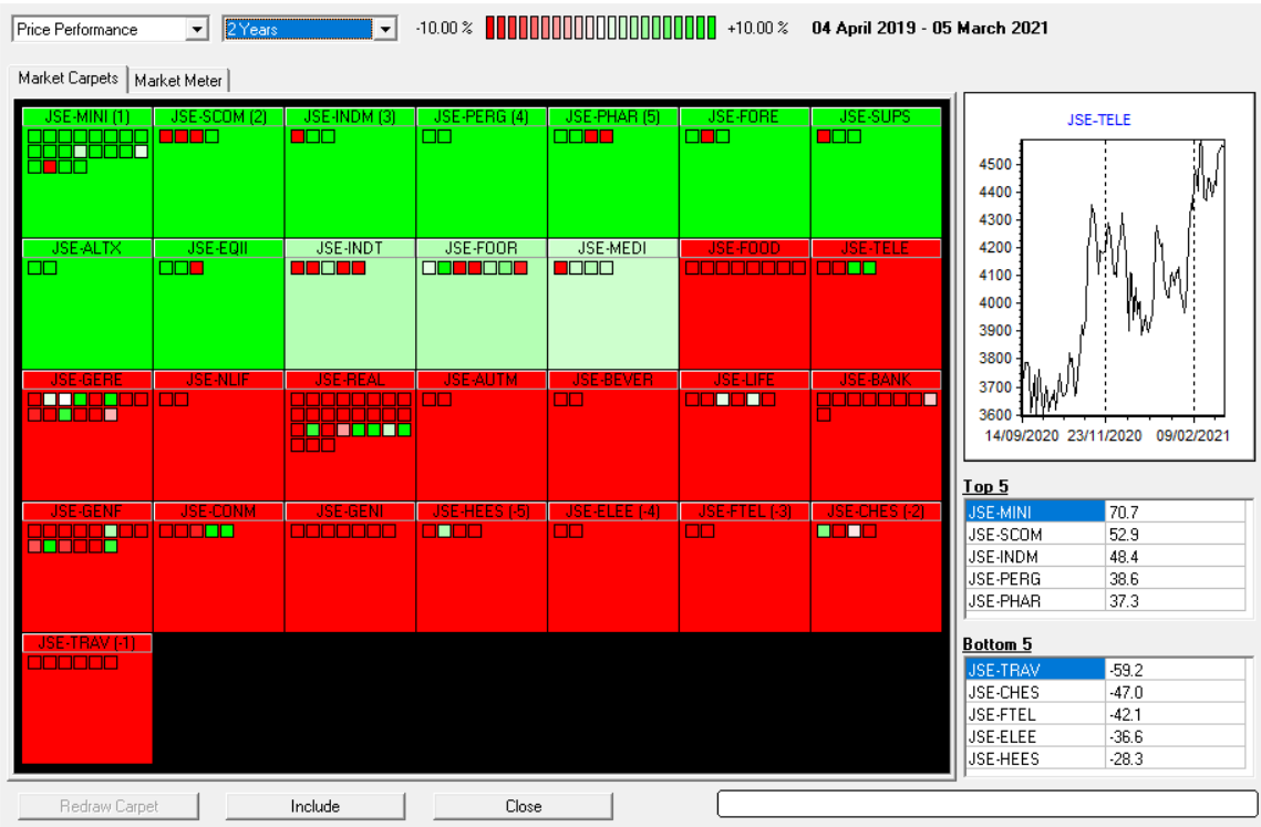
To get an overview of how the various sectors have being doing you should use the “market carpets” feature of your software. You will find it under the “scan” menu at the top of your screen.
You will find that the market carpets feature defaults to a single day – but that is not very useful to get a picture of what is going on – so we suggest that you change this to 3 months, 6 months or longer to see which sectors have been doing well and which not. Here is an example of a two-year market carpet:
Once you have found a few sectors that look exciting, you should look at the individual shares within those sectors. This can be easily done from within the program by opening the “Explorer” window (press any letter key) and then clicking the “sector” icon on the top right-hand side of the window. Then you should see this screen:
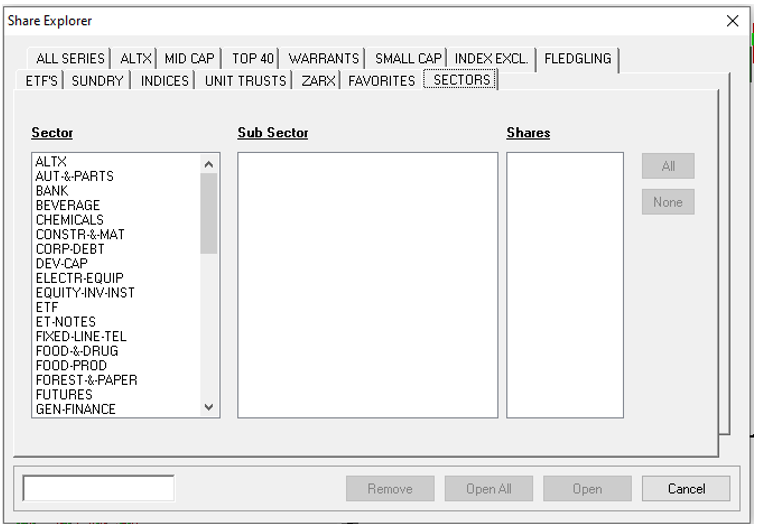
The effect of this is to sort the shares in the database alphabetically by sector – and then you can type in the first few letters of your chosen sector and it will put you at the top of the list of shares in that sector.
You could also use the price page of your newspaper which lists the shares alphabetically by sector. In this way you can flip through all the shares in a particular sector, making a note of their dividend yields and looking at their moving averages. Pretty soon you will begin to get a good idea of which shares appear good to buy. Remember to check and see whether they are in the JSE-Fin30 index, if you want to be more secure. The shares included in this index represent the largest and strongest companies trading on the JSE.
Another very good indicator on how the market is performing is the “Overall Market View” feature of the program. This is the first option under the Scan menu of the program. On activating this option, it will scan all the sectors and show an overview of each sector’s performance over a time period chosen by you. The first time it is opened it will default to the performance since the previous day. To establish the market’s performance over a longer time period, click on the down arrow next to “1 Day” at the top of the screen and select a longer time period. Obviously, if you are trying to see whether you are in a bull or bear market, it will be better to look at the position over 5 years.
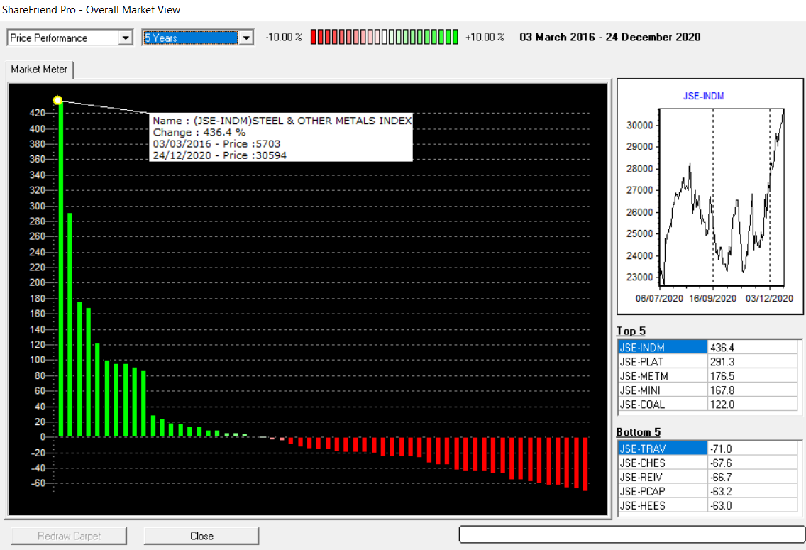
Each green or red bar represents the performance of a sector over the time period that you have selected, and this visual display will give you a very good idea of the general market direction and that of each sector within the market. Of course, some sectors have a much bigger market capitalisation than others – so it is not logical to simply see that there are more red bars than green and assume that it means we are in a bear trend. As you can see the diagram includes a pointer which enables you to look at the detailed performance of each sector.
GLOSSARY TERMS:
Warning: mysqli_num_rows() expects parameter 1 to be mysqli_result, bool given in C:\inetpub\wwwroot\newage\onlinecourse\content\lecture_modules_content.php on line 21
List Of Lecture Modules